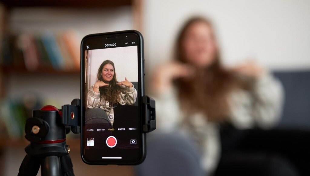
Cinematography for OTT Platforms: Shooting for Every Screen Size
The rise of OTT (Over-The-Top) platforms has completely transformed how audiences consume content. From smartphones and tablets to laptops and large 4K TVs, viewers now watch films and series on a wide range of screen sizes. This shift has redefined cinematography, pushing filmmakers to adapt their visual storytelling for every possible device.
In today’s digital era, cinematographers must ensure that every frame looks compelling—whether it’s viewed on a small mobile screen or a massive home theater display.
Understanding Multi-Screen Viewing
OTT audiences are no longer tied to a single viewing experience. A scene might be watched on a phone during a commute or on a large TV at home.
This creates new challenges:
- Maintaining clarity on small screens
- Preserving detail on large displays
- Ensuring consistent visual impact
👉 The goal is to create visuals that scale beautifully across all devices.
Framing for Different Aspect Ratios
Traditional cinema often uses widescreen formats like 2.39:1, but OTT platforms demand flexibility.
- 16:9 is the standard for most streaming platforms
- Vertical (9:16) is crucial for mobile-first content
- Safe framing ensures key elements are visible on all screens
👉 Cinematographers now compose shots with multiple aspect ratios in mind.